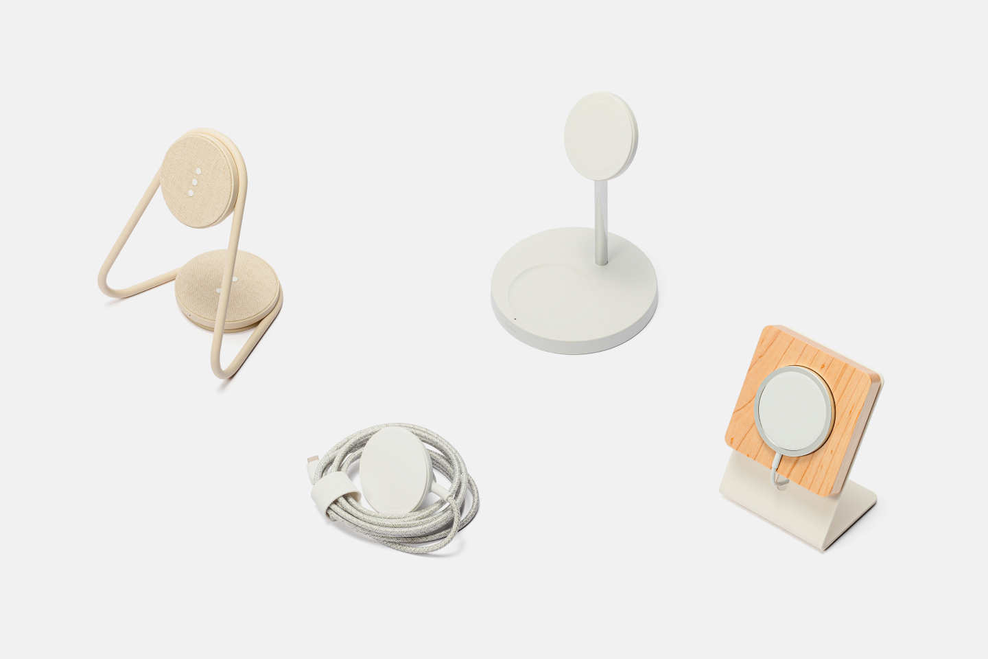

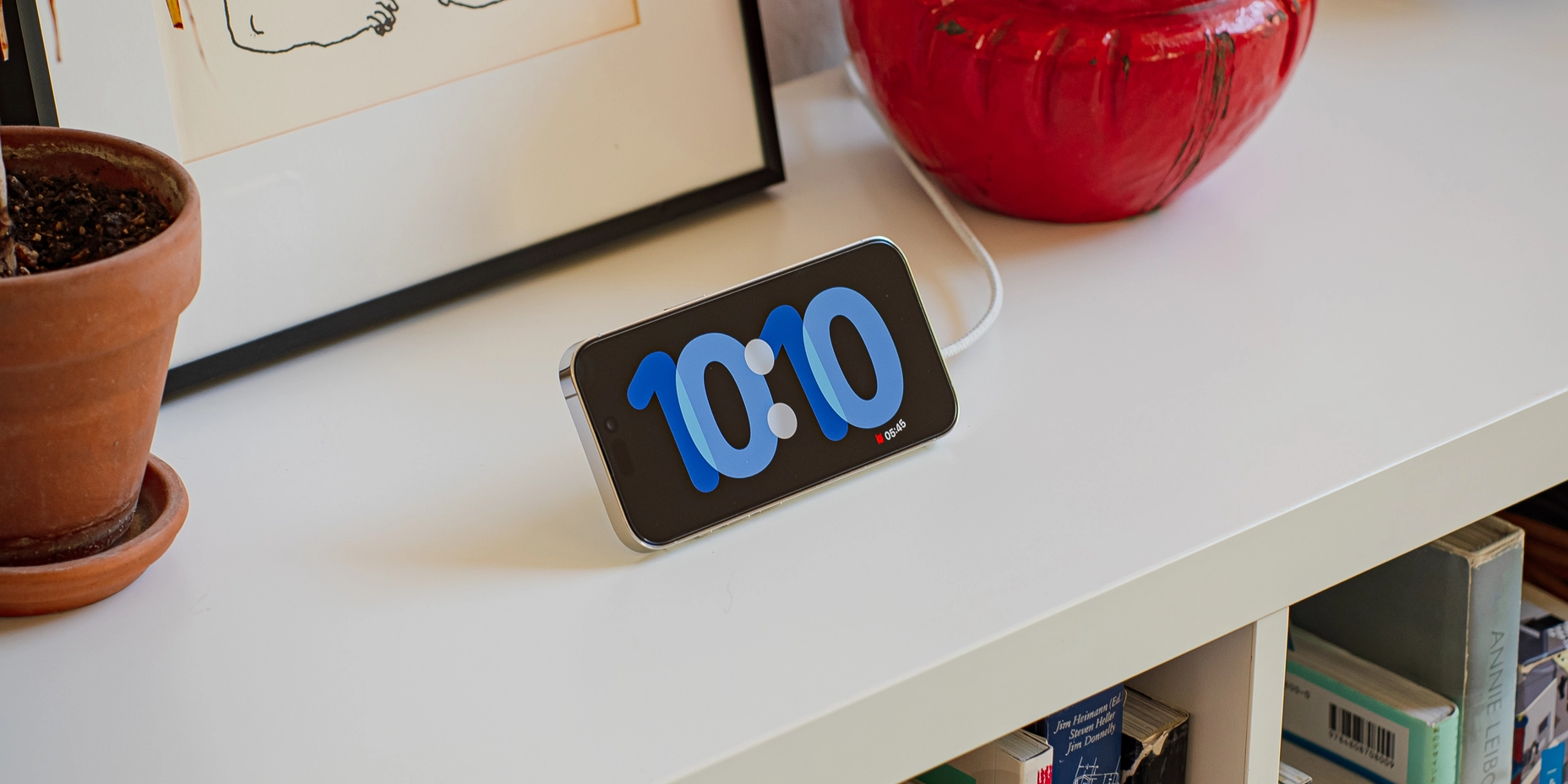
StandBy in iOS 17 turns your iPhone into a smart display. This fullscreen mode can be personalized with different clock styles, photos, and widgets. Live Activities, Siri, and notifications also appear seamlessly.
While you can technically use StandBy without a magnetic wireless charger, the experience is far better with one. I have found four of the best designed stands on the market today.
If you like the stands Apple uses at its retail stores, then this Belkin stand is as close as you’ll get. It will charge at 15W and remember the last used view. The base doubles as a 5W Qi charger perfect for AirPods. You can find this stand for around $100 in both white and black.
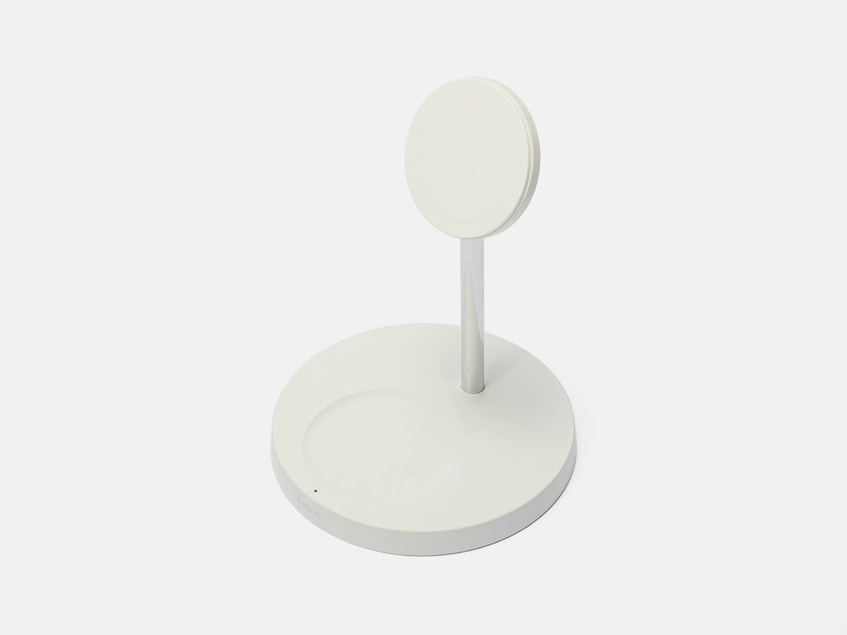
This is stand is my primary bedside charger. It replaces a Braun wireless charging clock and fits both the aesthetics of my bed and my iPhone.
Aside from Belkin’s confusing naming of their BoostCharge series, their products are as simple and Apple-like as you’ll find anywhere. The Belkin BoostCharge Pro 2-in-1 looks a lot like the MagSafe stand Apple uses in its retail stores, that it unfortunately does not sell to the public. This Belkin charger has a bonus Qi charger at the base perfect for AirPods. I went for the white model, but there is a black one as well. The unit charges via an included wall-wart-style AC adapter.
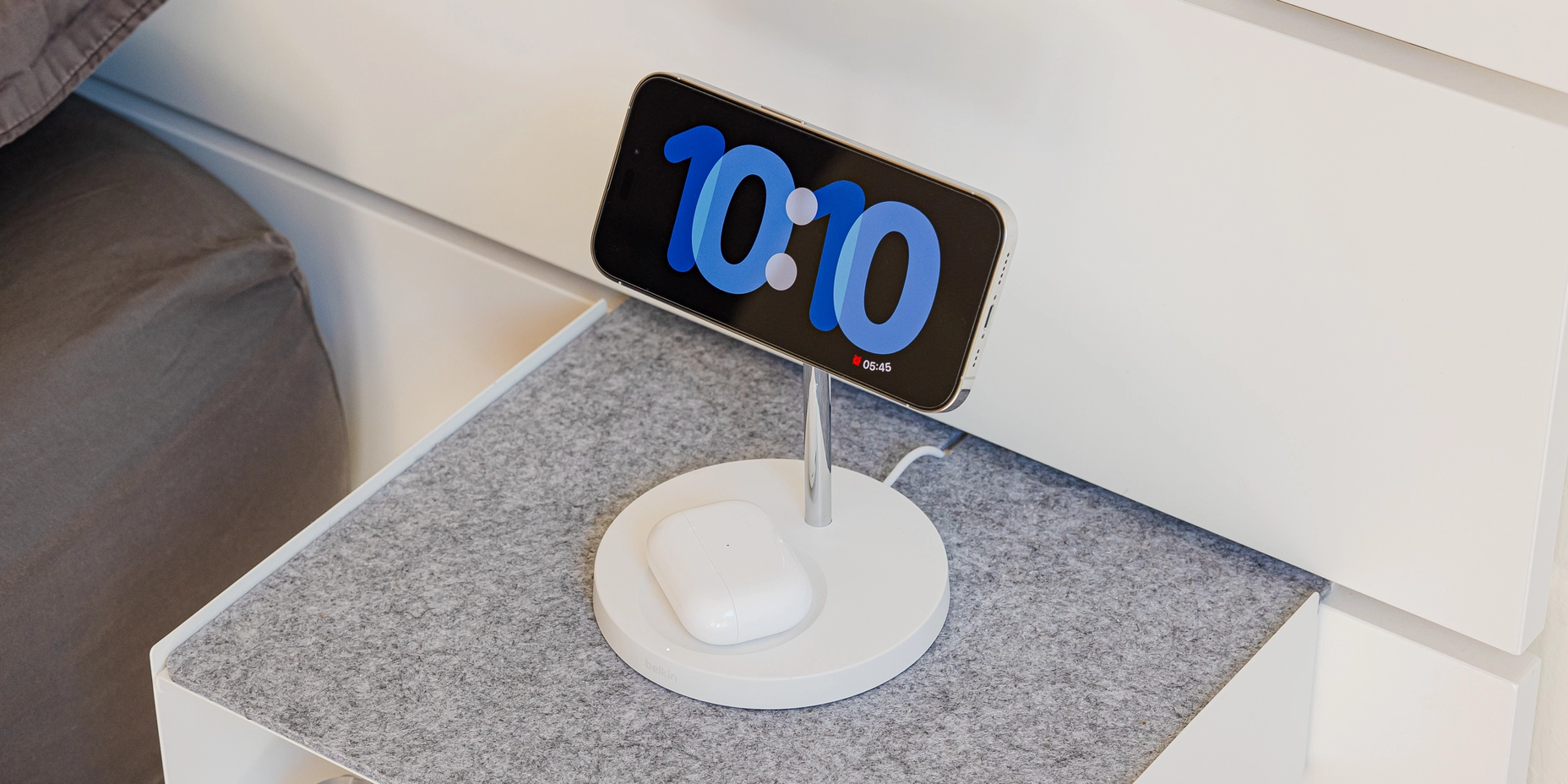
The base is circular, unlike the Apple’s rounded rectangle. It is dominated by a circular depression meant to charge AirPods, though any Qi-enabled device, including phones, will charge (at 5W). Underneath are four rubber pads that keep the device stable on smooth surfaces and regulatory markings.
At the front of the base is an unobtrusive Belkin logo and a LED indicator that stays on as the device on the lower pad charges. I wish Belkin either eliminated the indicator, or set it to turn off after a few seconds like the native indicator on the AirPods case. In a dark room, the LED can cast a dim glow.
The MFi-certified 15W MagSafe main charger is held up by a polished metal post. The back of the post has a plastic cover over a straight slot which is used in manufacturing to insert the cable. While not as seamless as Apple’s stand, the slot nearly invisible in normal use.
The stand 6.25” or 16cm tall. The height could pose a problem if you intend to place it below a low-mounted monitor. I had no issue with placing it at my bedside, under my monitor at my desk, or on a living room table.
The charging pad itself is slightly spherical at the back, with a rubberized white charging surface at the front. The edges of the rubber pad are exposed, so it is possible to chip it as I have done with my unit. It’s angled at around 60°, which is the sweet spot for viewing in most situations.
The unit does move a bit when I put my phone on and take it off, though not enough that I feel the need to readjust its placement every time.
At end of life, you can take of advantage of Belkin’s e-waste program to have the stand recycled.
The Courant MAG:2 Essentials and MAG:2 Classics chargers are designed to fit in a modern home. They won't charge at 15W or trigger the StandBy memory function. However, the elegant design and variety of textiles and finishes in natural tones make up for it.
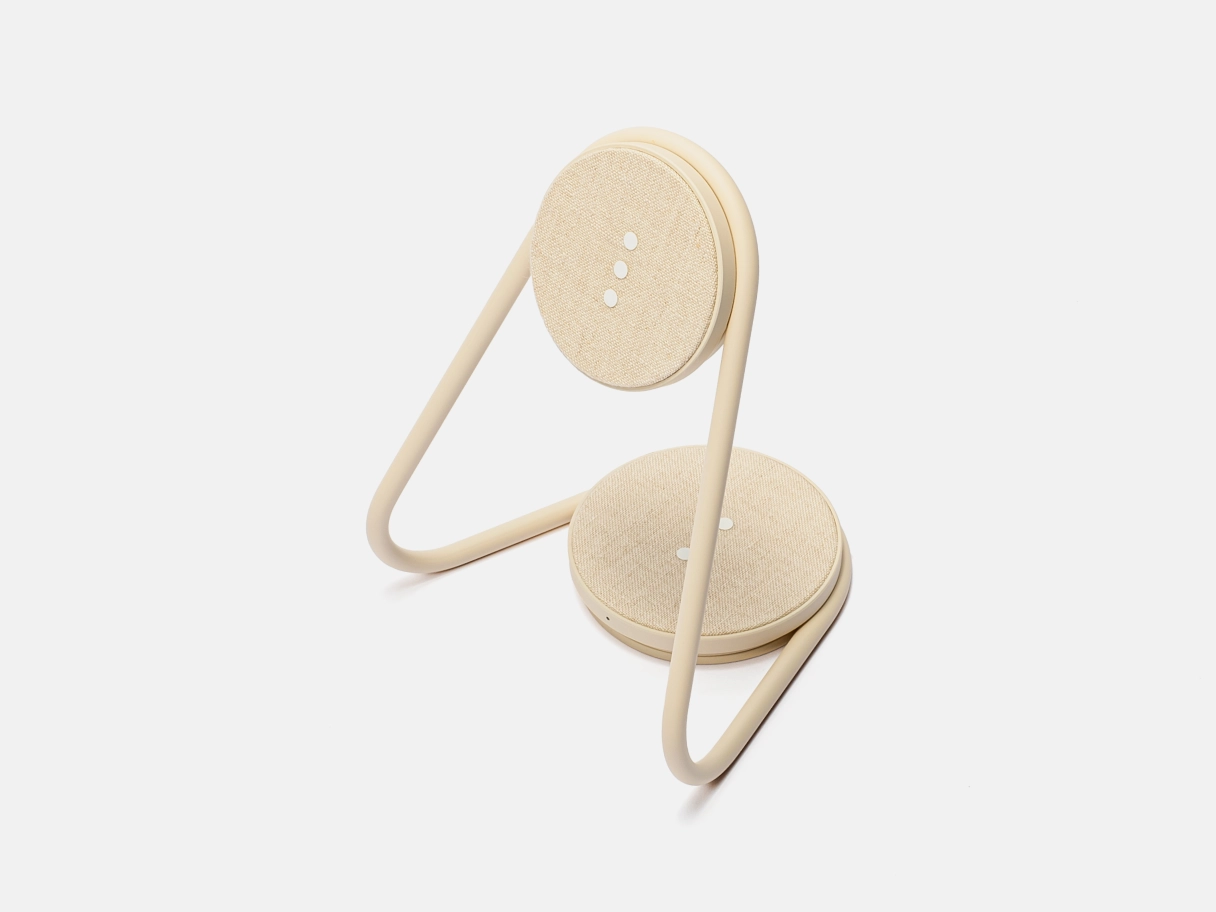
This is my recommendation to those of you that who employ a cosier colors and textures at home.
Courant’s MAG:2 line of chargers are identical in functionality and only differ in material choices. The Essentials line features linen charging surfaces, while the Classics line features leather. I went for an Essentials model in Natural color.
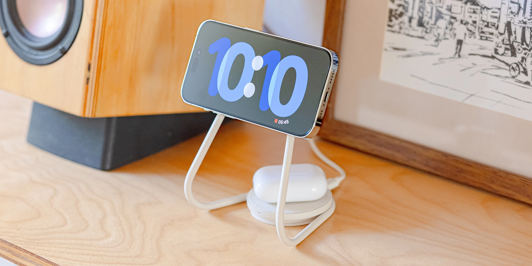
There are two circular charging surfaces — a smaller magnetic charger at a comfortable 64° tilt and a larger flat one that acts as a base.
At the back of the base is a USB-C port. The front has a small white LED indicator just like Belkin’s. I again wish that they either omitted it or programmed it to turn off after a few seconds. It could be distracting in a dark room.
Each has three rubberized dots — a motif used across Courant’s products to indicate a charging surface and to improve grip. The only craftsmanship issue I could find is a slight misalignment of the three dots on the bottom pad on my unit. The imperfection is not noticeable in normal use.
The top charger is not MFi-certified, meaning that it will charge at only 7.5W and not remember the last used view.
The two chargers are united by a single metal pipe that bends and snakes around the pads and carries charging wires.
Part lines are handled inconspicuously. Courant branding is hidden in the back of the top magnetic charging surface, while regulatory markings are printed on the bottom. Three rubberized pads help grip the charger to smooth surfaces.
Courant confusingly includes a USB-A charging brick and a Courant-branded USB-A to USB-C cable — both color matched to the charger. Though, you can use it with any USB-C charger and cable you have at home.
The entire unit is quite light, so expect it to move around a lot when you place and remove your phone.
Though the bottom charger is designed for smaller items like AirPods, it can charge any Qi-compatible device including phones.
Courant doesn’t have a recycling program like Apple or Belkin. So at end of life, this will likely end up in a landfill.
If you appreciate long-lasting, handcrafted products and would like to use StandBy as part of a larger desk setup, then the Gather MagSafe Phone Stand is for you. It holds an Apple MagSafe charger, balancing Ugmonk's design and Apple's engineering.
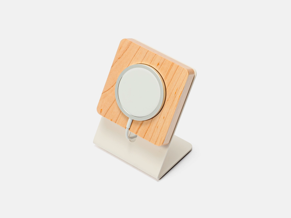
This stand replaces the Muji digital clock I previously had at my desk. The flexibility of the Gather system will allow me to keep evolving my desk setup.
Gather is a desk organization system designed and manufactured by Ugmonk in Pennsylvania. The full system of magnetic units can be composed in countless configurations. Each is made from varying combinations either white or black powder-coated steel, dark walnut or light maple wood and light grey or dark grey felt. The two metal and two wood options create four main color schemes you can choose from.
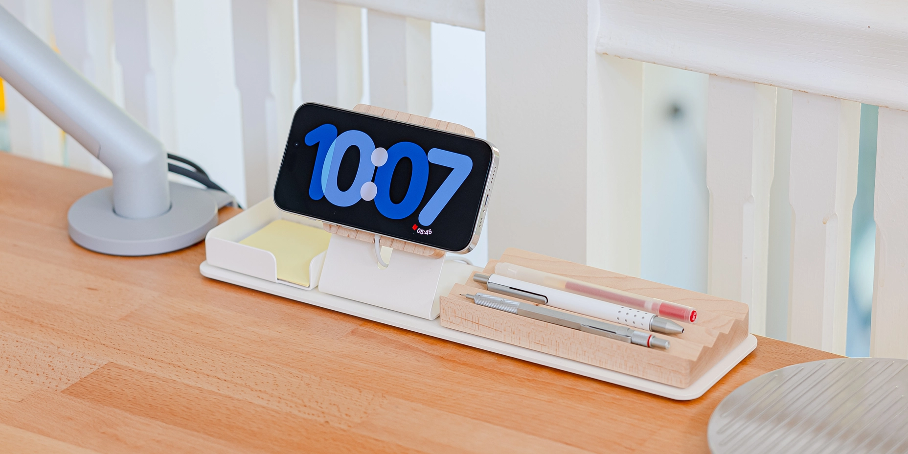
Given that I prefer using a monitor arm, I skipped the Large Monitor Stand, and went with the smaller Base Plate, a Note Tray, Wood ZigZag Tray, and MagSafe Phone Stand — all in white metal and maple. I’ll be focusing on the MagSafe Phone Stand for the rest of this review.
The Gather MagSafe Phone Stand isn’t technically a charger by itself. Rather, it’s a holder for Apple’s MagSafe Charger that you must purchase separately.
It’s composed of two parts. The holder is a rounded rectangular slab made from wood. It holds the MagSafe Charger via a microsuction pad in a round cavity. A shallow channel holds the cord and allows it to flow underneath. This wooden piece has a large magnetic pad underneath, which allows it to work standalone on any magnetic surface. I found it strong enough to work upside down. The wood is coated in a soft finish that highlights the natural grain while repelling water and dust.
On the back, a round cutout allows you to push the charger out, though I found the microsuction pad to hold on so firmly that I feared the charger would break. I don’t plan on removing it unless the charger breaks. The back also features a small notch that aligns to a tongue on the metal stand.
The metal stand is a piece of cut, bent steel shaped like an inverted 7. Underneath, it has a magnetic pad to secure it to larger components like the Base Plate or Large Monitor Stand. A pill-shaped cutout allows the USB cord to go behind and the aforementioned tongue sticks out at the top. The steel is sturdy and won’t bend unless you exert a lot of effort. The powder-coated finish is soft, but not too rough.
The MagSafe holder concept is an elegant design because Ugmonk can focus on the quality, handmade components, while Apple handles the complicated electronics. If the charger were to ever break, Apple will recycle it for you free and you can buy a new one. The steel and wood components should last a long time, but can likely be recycled at end of life.
This charger, with its sturdy construction, built-in kick stand, and cable management makes for the perfect travel companion.
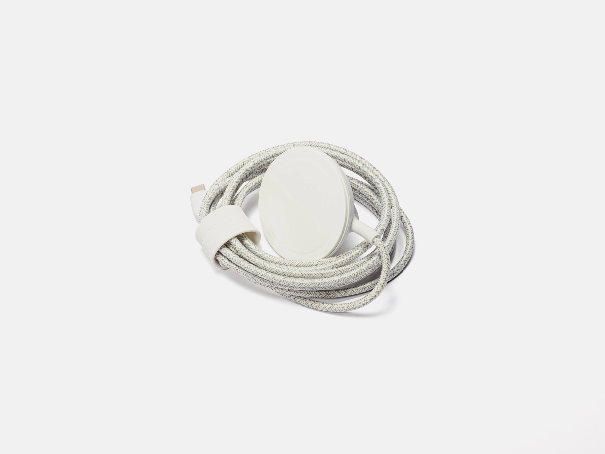
Belkin’s BoostCharge Pro Portable Wireless Charger Pad is my preferred bedside charger when I’m travelling. It’s a puck-like magnetic charger much Apple’s first party option. The charging surface, which is just a bit larger than Apple’s, is identical in size, shape and appearance to the one on the BoostCharge Pro 2-in-1. It’s available in black, dark blue, and white, which I chose.
The unit is a bit thicker than the Apple MagSafe Charger to accommodate the kickstand in the rear. The kicks stand features a Belkin logo on the outside and regulatory markings within.
The charger has a non-removable cord wrapped in dual-tone fabric much like cords found in other Belkin products.
Along the length of the cord is a movable rubberized cable management strap that closes via a snap fastener and hides more regulatory markings.
At the end of the cord is a Belkin’s signature rubberized USB-C connector and strain relief.
Given that the charging pad is smaller than iPhones, the precise angle it tilts to will vary based on the particular iPhone and case used. I found that my iPhone 14 Pro sits at 56°. This slightly shallower angle is perfect given that the iPhone will be low on the surface it’s place upon.
The puck is very lightweight and the magnet is strong enough to hold an iPhone upside down. Therefore, you will need to use two hands to remove your iPhone.
This is a MFi-certified MagSafe charger. So, it will charge at a full 15W (when connected to a powerful enough AC adapter). Curiously, the StandBy memory functionality didn’t work with this charger, like it does with the BoostCharge Pro 2-in-1 and the Apple MagSafe charger. I am unsure if it is a problem with my particular unit, or with all of them.
Just like with other Belkin products, at end of life, you can take of advantage of Belkin’s e-waste program to have the stand recycled.
For more information, read MacRumors’s full guide on how to use StandBy mode.
The stand should harmonize with the iPhone when in use. When not in use, it should fit in with its environment. Colors, materials, and finishes should either be neutral, or be offered in enough variety to suit the room it inhabits.
The stand should be comprised of simple shapes. An overdesigned stand will be too conspicuous at home.
Logos or other branding should be subtle or absent altogether.
The stand should firmly hold the iPhone, yet allow one-hand removal without moving too much.
It should reliably charge while not producing too much heat.
Ideally, it’s a MFi-certified MagSafe charger, meaning that it will both charge at 15W and enable the iPhone to remember the last used view.
Disparate materials should join together seamlessly with no gaps or movement. Surfaces should be free of imperfections.
The stand must last as long as it is needed with very little degradation aside from normal surface wear. The contact point with the phone should be durable enough to withstand years of placing and removing a phone
When it eventually nears end of life, it should be easily recycled. Ideally manufacturers offer an in-house recycling program.
I first compiled a long list of magnetic charging stands from Google Shopping and retailers like Apple, Amazon, and Best Buy. I also looked at review sites dedicated to Apple like MacRumors, 9to5Mac, and AppleInsider.
I cut down the list by first removing any options that look ugly or poorly made. Many stands have overly complicated physical forms, RGB LEDs, too many materials, and prominent logos. Stands that didn’t either come in neutral finishes or offer different options were removed.
I then looked at reviews, paying close attention to 1 and 2 star reviews. Any stands that had recurring mentions of poor craftsmanship or poor reliability were removed.
For testing, I used all these stands in various parts of my house for more than a month on the iOS 17 beta. I switched the stands out multiple times to make sure that each stand got enough usage in different contexts.
These are some stands that nearly made the list and why I decided not to recommend each one.